House of Commons adopts new accessible visual identity
6 September 2019
The House of Commons has updated its corporate visual identity to ensure it is accessible, in particular on digital platforms and mobile devices.
The House's visual identity was originally developed in 2009, and this summer's changes take account of the dramatic evolution of digital communications.
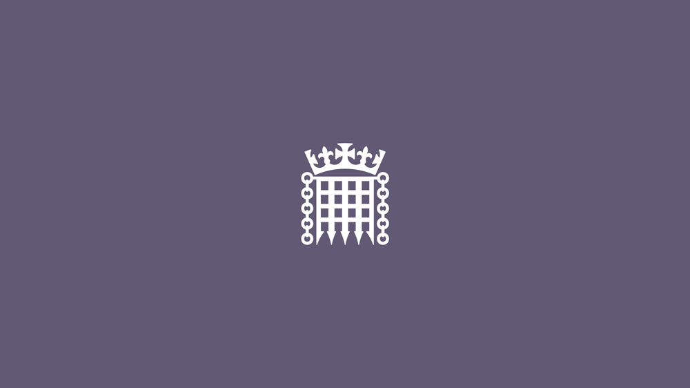
With a logo – or wordmark – that was not designed with digital use in mind, the identity was poorly suited to being viewed at small sizes. The updates ensure that accessible design principles are fully factored in. It features an updated rendering of the Crowned Portcullis symbol that works effectively at all sizes in digital environments, and follows the changes developed for the award-winning UK Parliament visual identity launched in 2018.
Alongside the updated version of the House of Commons wordmark, the identity includes an extensive colour palette, icons, illustrations and templates. Two highly accessible typefaces, National and Register, have also been selected for their excellent legibility in digital and print environments. The decision to adopt them was based on guidance from the British Dyslexia Association and the Digital Accessibility Centre. Together, these elements form a comprehensive design system which will be used by teams across the House of Commons Service.
The first corporate publication to feature the updated branding was the House of Commons Annual Report and Accounts 2018-19, which is available via the UK Parliament website.